You’re spending real money getting people to your landing page. Google Ads, Meta campaigns, SEO, the clicks are coming in.
But people arrive, look around, and leave.
That’s not a traffic problem. That’s a landing page problem.
(If you’ve been telling yourself more traffic is the answer, we’d push back on that.)
The frustrating part? Most of these mistakes are invisible to the untrained eye. Your page looks fine. But looks don’t convert; structure, clarity, and trust do.
The median landing page conversion rate sits at around 6.6% across all industries. Top performers regularly exceed 10–15%. The gap between average and excellent isn’t talent or luck; it’s avoiding the mistakes most businesses make without realising it. And it doesn’t require spending more on ads to close that gap.
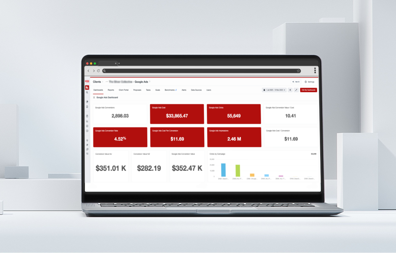
This article breaks down the most common, most damaging landing page mistakes, why they happen, and exactly what to do instead. We’ve pulled from real client work, current data, and the patterns we see every week inside DNM Digital’s CRO engagements.
Let’s get into it.
Small improvements to your landing page can make a major difference to how many visitors actually convert into leads and customers, especially when traffic is already coming in from your campaigns.
Why Your Landing Page Has One Job (and Most Fail at It)
A landing page is not a homepage. It’s not a brochure. It’s not a place to tell your whole story.
A landing page has one job: move a specific visitor toward one specific action.
The moment your page tries to do more than that, conversions drop. Every extra link, every competing message, every unrelated image is a distraction pulling your visitor away from that single goal.
Keep that principle in mind as we walk through the mistakes below. Most of them are symptoms of the same root cause: the page is serving the business’s desire to say everything, rather than the visitor’s need to understand one clear thing.
The 10 Landing Page Mistakes That Kill Conversions
1. Your Headline Doesn’t Tell Them What They Get
Most landing page headlines are either vague brand statements or generic feature descriptions. Neither works.
Visitors make a decision to stay or leave within a few seconds of arriving on your page. The headline is doing almost all of that work. If it doesn’t immediately answer “what’s in this for me?”, they’re gone.
Common offenders:
- “Welcome to [Brand Name]”
- “We Help Businesses Grow”
- “Industry-Leading Solutions for Modern Teams”
None of these tells a visitor what they’ll get, why it matters to them, or why they should keep reading.
The fix: Write your headline around the specific outcome your visitor wants. Not what you do; what they get. “Get 30% More Leads From Your Existing Traffic” beats “Conversion Rate Optimisation Services” every time.
If your ad promised something specific, your headline must echo that promise. A disconnect between ad copy and landing page headline is one of the fastest ways to kill trust before you’ve even had a chance to build it.
2. Too Many Calls to Action (Competing for Attention)
This one is counterintuitive. Giving visitors more options feels helpful, but it’s actually paralysing.
When a visitor lands on your page and sees three different CTAs (book a call, download a guide, view our portfolio, chat now), they don’t know which one to choose. So they choose none.
Decision fatigue is real. The more choices you present, the lower the likelihood of any single action being taken.
The fix: One primary CTA per page. You can repeat it multiple times, at the top, after your value proposition, after social proof, and at the bottom. But they should all lead to the same action. Every element on the page exists to drive that one outcome.
If you’re genuinely offering multiple services or pathways, build separate landing pages for each audience segment. A business owner arriving from a Google Ad for “Google Ads management” should land on a Google Ads-specific page, not a generic services page with a dozen options.
3. Weak or Buried Calls to Action
The flip side of having too many CTAs is having CTAs that don’t work. A landing page without a strong, visible, compelling call to action is like a sales conversation that ends without asking for the business.
Weak CTAs look like:
- “Submit”
- “Click Here”
- “Send”
These tell visitors nothing about what happens next and give them no reason to act.
The fix: Make your CTA specific, benefit-driven, and visually impossible to miss. “Get My Free Strategy Session”, “Download the Guide”, or “Start Getting More Leads” are infinitely stronger than “Submit”.
Contrast matters here, too. Your CTA button needs to stand out from the rest of the page. If a visitor has to hunt for it, you’ve already lost them.
4. Slow Load Speed
This one has a number attached to it: a single second of delay reduces conversions by around 7%. Pages taking more than 3 seconds to load see 53% of mobile users bounce before the page even finishes rendering.
If you’re spending on paid traffic, every slow second is costing you twice, once in the ad spend that drove the click, and again in the conversion you didn’t get.
Speed isn’t just a user experience issue, either. Google’s Core Web Vitals directly factor into your Quality Score on paid campaigns and your organic rankings. A slow page hurts you on both fronts.
The fix: Run your page through Google PageSpeed Insights. Address the biggest offenders first, uncompressed images, render-blocking scripts, and hosting quality are usually the culprits. Aim for a load time under 2 seconds. On mobile especially, this is non-negotiable.
5. The Page Isn’t Built for Mobile
Here’s a stat that should put mobile optimisation front of mind: approximately 82.9% of landing page traffic now comes from mobile devices.
That means if your page is designed for desktop and “fine” on mobile, you’re delivering a poor experience to the vast majority of your visitors. Pinching to zoom, squinting at small text, and tapping buttons that are too close together, visitors on mobile don’t tolerate friction. They just leave.
The fix: Design mobile-first, not mobile-as-an-afterthought. Your layout, text size, button sizes (minimum 44×44 pixels), and form fields all need to work flawlessly on a small screen. Test it yourself on a real phone, not just an emulator. If you’d find it frustrating to use, your visitors will too.
6. No Trust Signals (or the Wrong Ones)
Your landing page is often the first time a visitor encounters your brand. They don’t know you yet. They have no reason to trust you. And without trust, no one hands over their details or their money.
This is especially true for service businesses, professional services, and B2B. The stakes feel higher, and visitors are more sceptical.
Trust signals work because they shift the proof burden away from your claims and onto third-party validation. And the data backs this up, pages featuring testimonials and reviews convert around 34% higher than those without them.
The trust signals that actually move the needle:
- Genuine client testimonials (specific outcomes beat generic praise)
- Recognisable client logos
- Star ratings or Google review counts
- Case studies with real numbers
- Certifications, accreditations, or industry partnerships
- Security badges on forms and checkout pages
The fix: Don’t just add a testimonials section at the bottom and call it done. Place trust signals strategically, near your CTA, near your form, and anywhere a visitor might hesitate. Social proof should appear at the moment doubt arises, not after you’ve already lost them.
7. The Form is Asking Too Much
Long forms kill conversions. The data is unambiguous: 81% of people abandon forms after starting, and 67% never return to complete them.
Forms with 5 or fewer fields convert 120% better than longer ones. Every additional field beyond the essentials is a conversion penalty you’re imposing on yourself.
The most common mistake we see? Businesses ask for every piece of information they’d ever want in their CRM, right upfront. Name, company, phone, email, budget, timeline, how they heard about you, all in one go. Visitors feel interrogated, not welcomed.
The fix:The fix: Ask only for what you genuinely need at this stage of the relationship. For most service businesses, a first-touch form needs three things at most: name, email, and phone (or just email, depending on your nurture sequence). You can qualify further once you have the lead.
For longer forms that are genuinely necessary, break them into multi-step formats. Showing a progress indicator (“Step 1 of 3”) dramatically reduces abandonment because visitors have already committed to starting.
8. No Message Match with Your Ads
This is one of the most commonly overlooked mistakes, and it directly undermines your ad spend.
Message match means the language, offer, and visual tone of your landing page should closely mirror the ad that brought the visitor there. When a visitor clicks an ad promising “Free Website Audit” and lands on a generic services page, the mismatch creates immediate doubt. They wonder if they’re in the right place — and most decide they aren’t.
Poor message match increases bounce rates, tanks your Quality Score, raises your cost per click, and wastes the intent signal that brought that visitor to you in the first place.
The fix: Build dedicated landing pages for each ad campaign or ad group. If you’re running separate ads for different services, audiences, or offers, each one deserves its own landing page that continues the specific conversation the ad started. This isn’t just a conversion best practice; it improves your Google Ads Quality Score, which directly lowers your cost per click. Not sure whether Google Ads or Facebook Ads is the right channel for your campaigns? That choice also affects what your landing page needs to do.
9. Too Much Copy, Too Little Clarity
More words don’t mean more persuasion. A cluttered, copy-heavy landing page overwhelms visitors and buries the key message they need to make a decision.
Here’s a finding worth bookmarking: landing pages written at a 5th–7th grade reading level convert at 11.1%, compared to just 5.3% for pages written at a university level. Simpler, clearer writing doesn’t just convert better, it converts roughly twice as well.
Visitors skim. They scan headlines, bullet points, and CTAs. If your value proposition is buried in paragraph four of dense marketing copy, it will never be read. (The same problem plagues blog content, here’s why blog traffic often fails to convert, and what to do instead.)
The fix: Lead with the most important information. Use short paragraphs, clear sub-headings, and concise bullet points. If a sentence doesn’t directly serve the visitor’s decision to act, cut it. Then cut it again. Pages with fewer elements consistently outperform cluttered ones, landing pages with fewer than 10 elements convert at approximately twice the rate of pages with 40 or more.
10. No Testing, No Iteration
This is less a single mistake and more a compounding one. Every other mistake on this list gets worse when it’s never identified or addressed, because without testing, you’re flying blind.
The highest-converting landing pages in the world got that way through systematic iteration. They started good, tested variations, read the data, and got better. The businesses with underperforming pages are usually the ones who built something, launched it, and never touched it again.
The fix: Set up A/B testing. Start with the highest-impact elements: your headline, your CTA button copy, your hero image or video, and your form length. Test one variable at a time, run tests until you have statistical significance, then implement the winner and start the next test.
Pair this with heatmapping tools (Hotjar, Microsoft Clarity) to watch where visitors actually click, scroll, and drop off. The data will tell you exactly where your page is losing people, if you’re willing to look. For a broader view of where CRO fits into your overall growth strategy, this breakdown of how CRO increases ROI without increasing ad spend is worth your time.
A Quick Diagnostic: Is Your Landing Page Leaking Conversions?
Before you overhaul everything, run through this checklist.
- The headline clearly states what the visitor gets (not just what you do)
- There is one primary CTA, repeated at logical intervals
- The CTA copy is specific and benefit-driven
- The page loads in under 2 seconds on mobile
- The page works flawlessly on a real mobile device
- There are genuine trust signals placed near conversion points
- The form asks for 5 fields or fewer
- The page language matches the ad or link that brought the visitor here
- The copy is scannable: headlines, short paragraphs, bullet points
- There is an active testing programme in place
If you’re ticking fewer than seven of those boxes, you have clear, actionable improvements to make, and they don’t require more traffic or a bigger ad budget.
What This Looks Like in Practice
A client came to DNM Digital spending $6,000 per month on Google Ads. Traffic was healthy. Conversions weren’t.
A review of the landing page revealed four of the mistakes above: a generic headline with no message match, a long form asking for seven fields, no visible trust signals above the fold, and a load time over 4 seconds on mobile.
We rebuilt the page around a single, specific offer. Reduced the form to three fields. Added Google Reviews and client logos near the CTA. Compressed images and fixed render-blocking scripts to bring load time under 2 seconds.
Conversion rate went from 1.8% to 4.3% within six weeks. Same ad budget. More than double the leads.
That’s what fixing landing page mistakes actually looks like.
The Bottom Line
Getting traffic to your landing page is only half the job. What happens after the click is where revenue is won or lost.
The good news? Every mistake in this article is fixable. None of them require a full website rebuild or a larger ad spend. They require honest diagnosis, targeted fixes, and a commitment to testing what works.
If you’re not sure where your page is falling short, that’s where we come in. DNM Digital offers landing page audits and CRO strategy reviews that identify exactly where your page is leaking conversions and what to do about it. If you’re also looking to build a more reliable pipeline beyond single pages, read our guide on how to build a scalable lead generation system.
Ready to get more from the traffic you already have? Book a free strategy session with the DNM Digital team.